Content
What to include and what not to include in your academic poster.
Deciding on the amount of text
Due to the limited amount of space available, you鈥檒l need to carefully control how much information to present, providing either a brief overview of your work (a bit like an abstract) or a deeper exploration of one particular aspect. It鈥檚 easy to overestimate how much writing you can fit on an academic poster, so try to have a clear idea about exactly what it is you want to communicate to your audience.
If you鈥檙e designing a poster based on a previous assignment or research, you may find it more manageable to choose one particular aspect to focus on in the poster than try to cram everything in and risk overloading the audience. Try to summarise the main point you want your poster to communicate in a sentence or two. If you can鈥檛, that might indicate that you鈥檙e trying to convey too much.
For each of the following examples you can download a full PDF version of the image displayed.
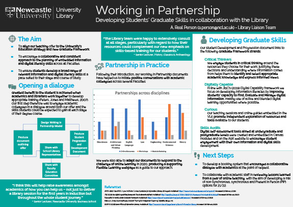
Example 1
This poster contains a fair bit of text in small font, which may make it difficult to read. In an exhibition space, viewers would have to get close to the poster, potentially blocking the view of others. It may also take a long time to read, so the creator has added subtitles to make the poster easier to navigate and put some of the key findings in bold to help viewers identify the most important information quickly and easily. Depending on the size, your conference or event might include 20-200 posters and so viewers will be unlikely to invest a large amount of time on any single poster.
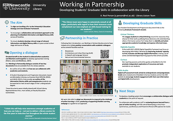
Example 2
This poster uses blank space, attractive images and bullet points rather than full sentences to reduce the amount of words contained on the poster. This makes it easier to read and absorb the main points in a short period of time, but the reader might also be left wanting to know more. For example, in the 鈥楶artnership鈥� section, they might want to know more about what exactly the 鈥榩ositive conversations鈥� look like. In this instance, the creator has added a QR code that links out to more detail if the viewer wants it.
Communicating with visuals
Posters also allow you to communicate information visually, rather than through words and you might find it more efficient (and easier on the eye) to avoid large blocks of text. Think about what information could be more easily or concisely communicated using images, charts and/or diagrams. You can also save space by strategically using references or links that tell the reader where they might find any information that you don鈥檛 have the space to include.
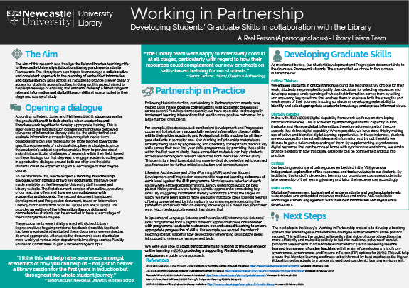
Example 3
This poster uses different graphics to make different types of information easier for the audience to process. It uses bar charts to compare data and a diagram to illustrate relationships. However, graphics don鈥檛 speak for themselves, so it鈥檚 helpful to provide a bit of text explaining the graphic that not only tells the reader what it shows, but also why it鈥檚 significant.