Style
How you choose to present the content on your academic poster.
The style you choose for your poster can vary depending on the purpose and topic of what you鈥檙e presenting. However, there are some general ground rules to keep in mind to make sure your poster is visible and accessible to all. This will make your poster more accessible to all readers by freeing up their headspace so they can dedicate more mental energy to understanding the information instead of deciphering the text:
- The writing should be in a simple, 鈥榮ans serif鈥� fonts (fonts that don't include small lines or embellishments at the end of letters) like Calibri, Arial, Verdana or Helvetica. These fonts reduce the chance of letters blurring into one another and slowing the reader down.
- The font should also be large enough to be read easily, which is generally no smaller than 24-point. However, the ideal font size will change depending on the environment. For example, if your poster is being presented online the audience can zoom in so the font can be smaller than presenting in person. Or if you鈥檙e presenting in a small exhibition space with limited access you may need to make the font larger so it is legible from several metres away.
- If using colour, make sure they contrast with one another, otherwise it can become difficult to distinguish words from the background. If you鈥檙e unsure about the use of contrasting colours,
Poster styles can vary and it can be hard to know what choices to make. Some questions you might want to ask yourself are:
- Do I want/need it to feel formal or informal?
- Do I want/need to use long sentences or short? Complex language or simple?
- Do I want/need to communicate personal reflection or detached evaluation?
- Do I want/need to use lots of images or lots of text?
- Do I want/need to use lots of colour, or keep it simple?
To answer these questions you might want to refer back to the 鈥榓udience profile鈥� and think about ways of navigating what they want/need to get from the poster and what you want/need to get from the poster. For example, if you have an expert audience who you anticipate would know a lot about your field it may be more appropriate to use some complex, subject-specific terminology. Or maybe your goal is to simplify a complicated phenomenon, in which case you might choose to create a more informal feeling poster that uses lots of images and simple text. There鈥檚 no right answer to these questions and sometimes your wants and needs might clash with those of the audience. In these cases, the task is to try and find a way to negotiate between your own goals and those of the audience.
For each of the following examples you can download a full PDF version of the image displayed.
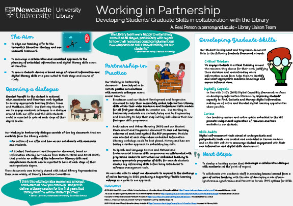
Example 6
This poster uses playful fonts, cartoons and illustrations to create a personal, 鈥榣ow-tech鈥� feel that some viewers might find inviting and visually appealing. However, the font choice makes the text more difficult to read, especially for audience members with visual impairments or learning difficulties. The personalised approach also makes the poster look less 鈥榩rofessional鈥� and may be inappropriate for some conferences or events, depending on the image you want to project.
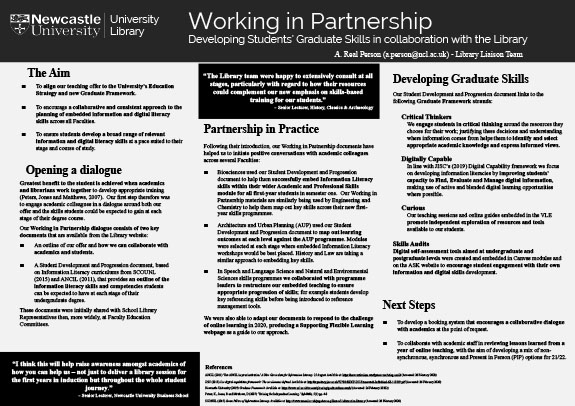
Example 7
The use of black and white colour scheme, Times New Roman font and lack of images creates a poster that looks formal and professional in design but not very visually appealing. An academic poster doesn鈥檛 have to be a work of art and the simple design allows the creator to communicate their ideas succinctly and efficiently. However, the poster is less likely to catch the eye of roaming audience members in a busy conference space and Times New Roman can still cause eye strain due to serifs. Including some graphics and/or altering the structure and colour schemes are some ways that this poster might be made more visually appealing.